




01 / UI/UX redesign
UI/UX design
We redesign the flows the audit flagged in your live product, then test them again.
- The flagged flows, redesigned
- A prototype to test the fix
- Handoff to your developers
- A re-test after release
Design
Build
Not sure where to start? Start a project
Latest articles
Resources
 Latest articleHow to Choose a Design Agency in 2027: A Practical Checklist
Recent cases
Explore
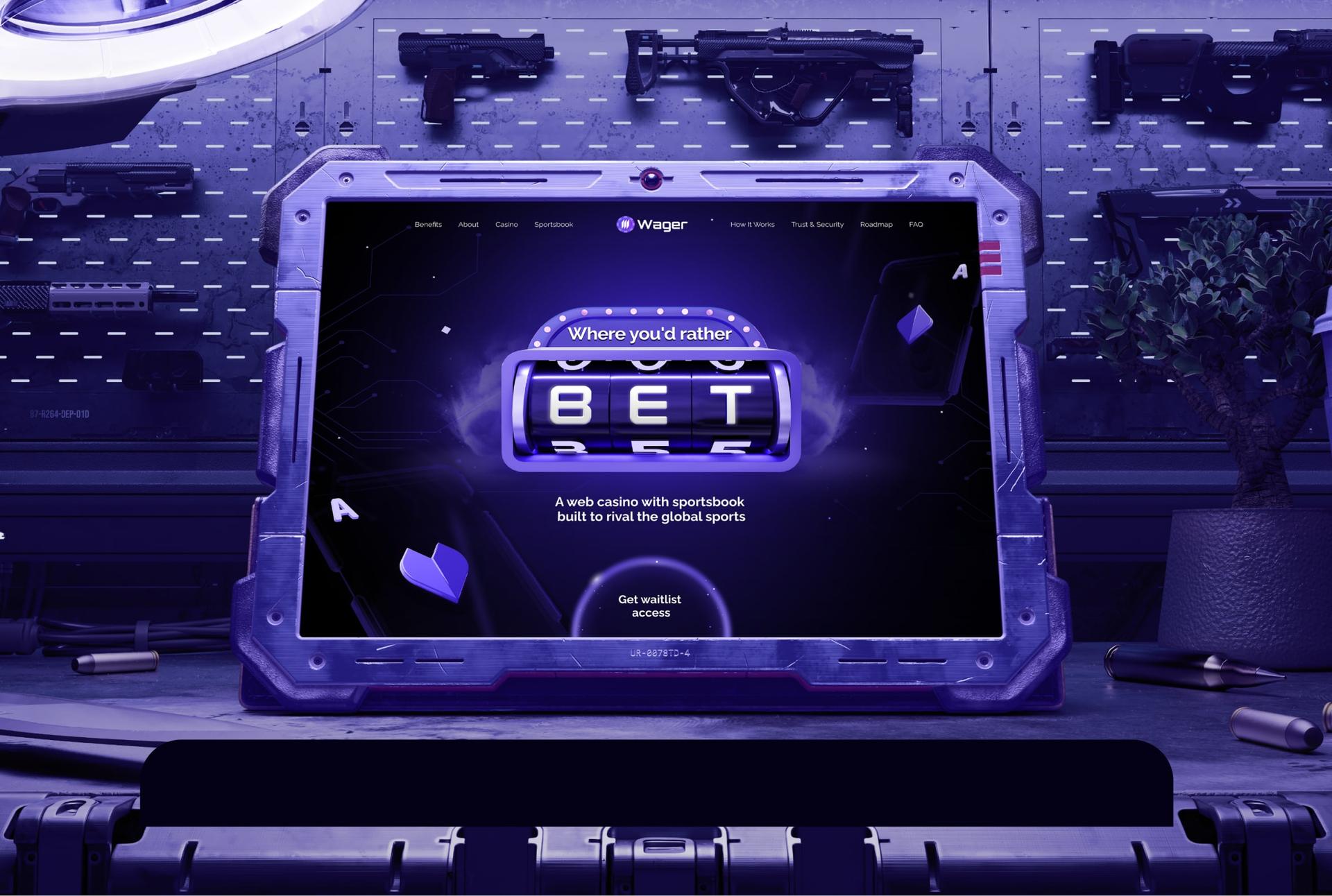 Case studyiGaming Branding & Web Design: Crypto Casino
Find the friction. Fix it first.
We review your product or site, check the key flows against real behaviour and hand you a ranked list of fixes. Fixed scope, report in 3–14 days depending on product size.
 — Kids sport — 2,000 kids a week — Franchise · HK & Singapore — Multi-sport classes for kids in Hong Kong and Singapore.
 — Robotics · AI — $13.5M Series A — 1M+ inspections — Clients: Shell, BP, BASF — Autonomous robot inspections for industrial sites.
 — AI · Fintech — $480M+ consumer debt resolved — Y Combinator S24 — AI voice agents for debt collection.
 — Diagnostics — ~400 people across the UK & Switzerland — Ex-Nasdaq — Multiplex diagnostics for autoimmune and allergy testing.
 — Fintech — €11M+ investor capital — Quant crypto trading for everyday investors.
 — DeFi · Credit — $8.35M raised — Andrew Keys, Iceberg Capital — Real-world credit, onchain.
 — Healthcare AI — €1.75M raised — Backed by Hugging Face & DEGIRO founders — AI that turns consultations into clinical notes.
 — Health AI — 80,000+ patient portals connected — MyChart & Epic — An AI health companion that keeps care on track between visits.

 — Crypto infra — Green mining · UAE — Bitcoin mining and AI compute infrastructure.
 — Web3 security — $90M Series A — Led by Summit Partners — Security for the world's digital assets.

 — DeFi — ~$200M daily trading volume — GMX on Solana · 90+ markets — Onchain perpetuals, now on Solana.
 — Crypto PR — Official PR partner of Dune — Earned media for crypto brands.
 Credifi — DeFi · Credit — $0 fees on any loan — Funded onchain — Instant personal loans, paid to a crypto wallet.
 — Web3 marketing — 900+ crypto brands served — Clients: MetaMask, OKX — The marketing agency crypto brands use.
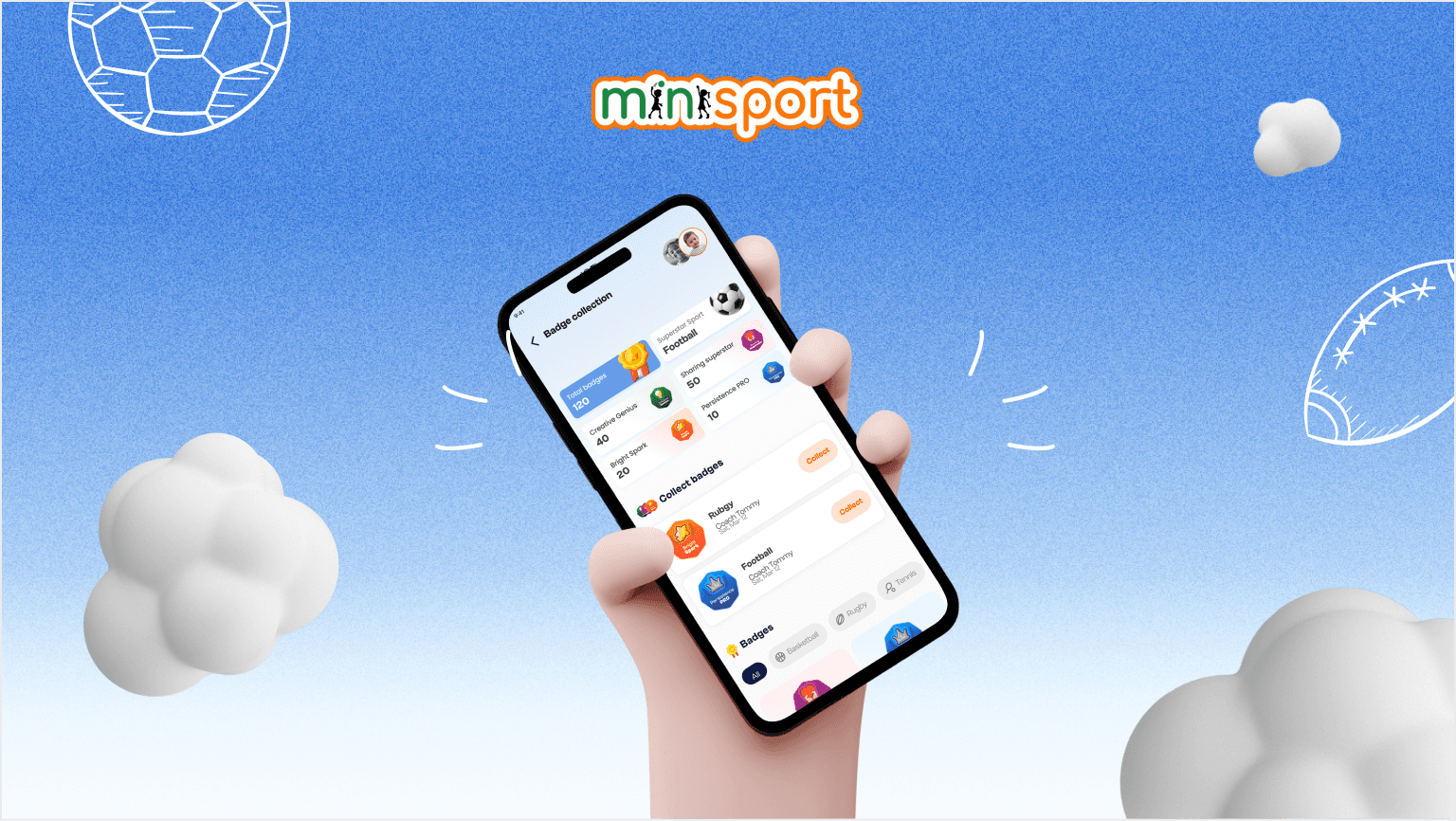
We rebuilt the parent-and-coach app flows so one account handles every child’s schedule, progress and bookings, and restructured the website to turn traffic into applications. After the redesign, satisfaction rose 23% and ad conversions 36%.
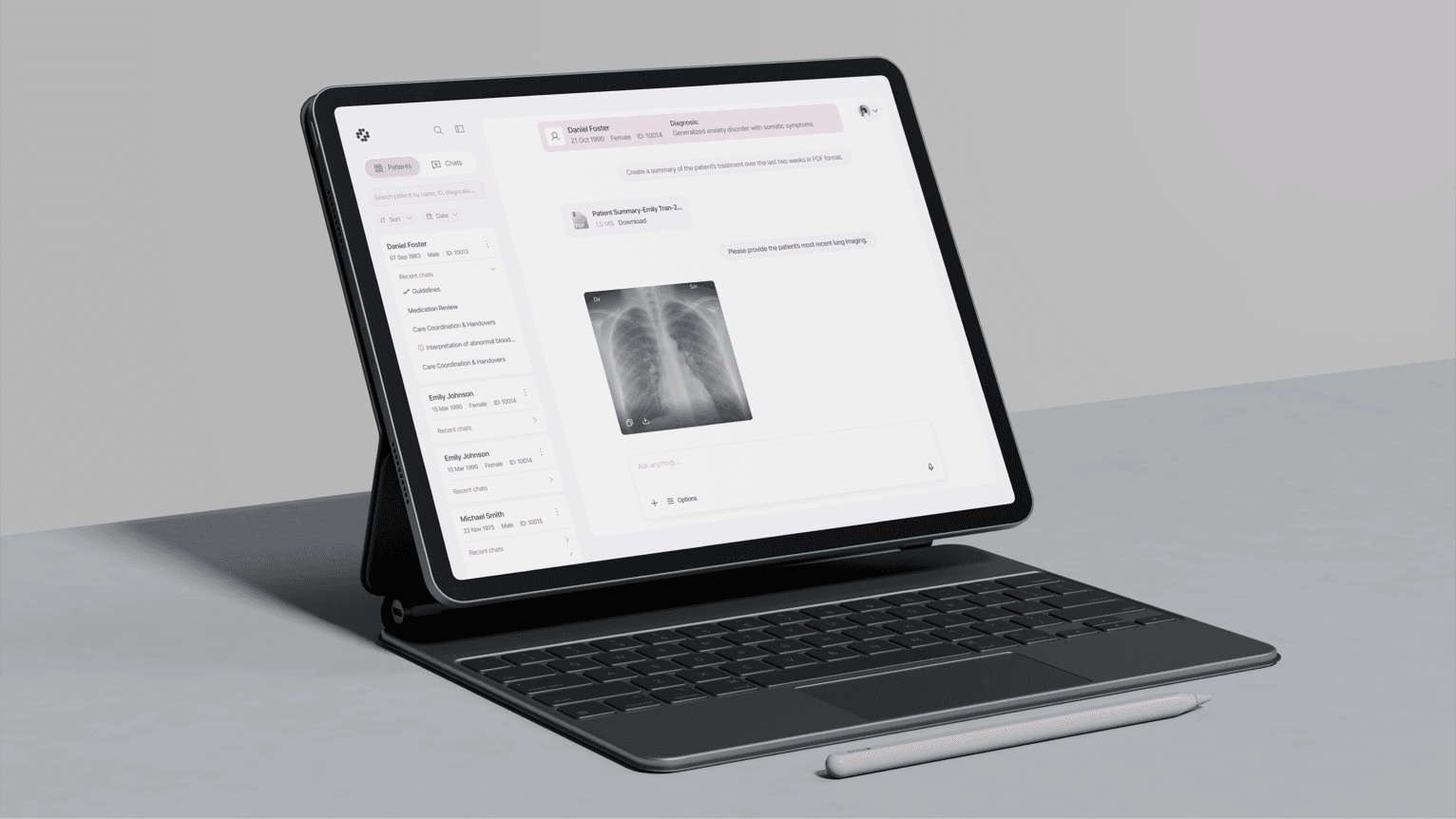
Read the case study: MinisportDelphyr summarises records and flags what needs attention. We designed the assistant, the review flows and the product site around it.
Read the case study: Delphyr“They ask the right questions, challenge decisions, and help us build things that actually make sense.”

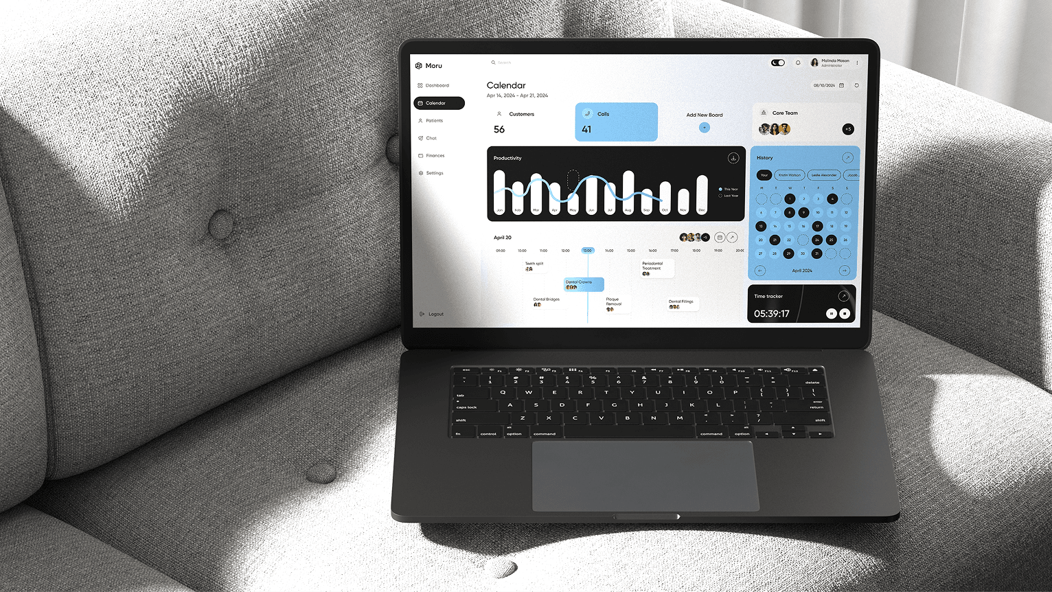
We followed doctors, nurses and front-desk staff, audited the tools they juggled and refined the flows with them: scheduling, patient chat, finances and dashboards in one interface.
Read the case study: Moru“People sign up, look around and leave. Trials don't turn into paid accounts.”
We find the step where they give up and show you what to change first.
Sign-up → Paid · For SaaS teams with trial drop-off · Funnels · Recordings · Key flows · About 3 days for one product area
“Analytics show the same step losing people every week. Rewriting the copy hasn't helped.”
We test the step against real behaviour and rank the fixes by impact.
Onboarding → Activation · For products that lose people early · Analytics · Sessions · Walkthrough · Report in 3–14 days
“Support answers the same questions every day. Every new feature makes it harder to use.”
We trace the questions back to the screens that cause them, with a fix for each.
Product → Redesign · For products that grew feature by feature · Support tickets · UI inventory · WCAG · Fix order agreed on the last day
( What we check )
For each area we look at the screens, your analytics and how people actually get through the task.
Every finding lands in one report, ranked by what it costs you.
Onboarding and activation
Every step from sign-up to the first moment the product is useful: what we ask for, what people skip and where they stop.
Key flows
The few tasks your business depends on, such as creating a project, inviting a teammate or paying. We run each one start to finish, including the empty, loading and error states.
Navigation and information architecture
Whether people find features without help: menu labels, page structure, search and where settings live.
UI consistency
Buttons, forms, tables and messages that do the same job but look or behave differently from screen to screen.
Accessibility
Contrast, keyboard use, focus, error messages and target sizes, checked against WCAG 2.2 AA, including the criteria 2.2 added such as Target Size (Minimum) and Accessible Authentication (Minimum).
Mobile
The same key flows on a phone: tap targets, forms with the on-screen keyboard open, and what gets cut on a small screen.
( Why teams pick us )
Funded startups and growing companies across the US, Europe, the Middle East and Asia-Pacific.
( Audit or testing )
Three names that get mixed up. Two of them are parts of the third.
What happens
A UX expert checks each screen against usability principles, such as Nielsen's ten heuristics.
What it tells you
Where the interface breaks known rules. Not how many users that costs you.
What happens
Real people try set tasks in your product or prototype while we watch.
What it tells you
Where people get stuck, seen first-hand. Not always why, and only on the tasks you tested.

What happens
Both of the above, plus your analytics and recordings, ranked by impact and effort.
What it tells you
What to fix first and why, with the evidence for each item and a fix for the top problems.
How we check: a heuristic evaluation against Nielsen's ten usability heuristics, your analytics and session recordings, a walkthrough as a new user, and usability sessions with real users on larger audits.
( Sample report )
Every finding is one row: the problem, the evidence, what it costs you, the fix and a priority. Your team starts at the top and works down.
Onboarding
Sign-up asks for company size, role and teammate invites before the user sees the product.
The funnel loses the most people on the invite step. In sessions, users skipped it or closed the tab.
Fewer trials reach a first schedule, so fewer of them convert.
Keep sign-up to email and password. Ask for invites after the first schedule is created.
Key flow
The Save button on the schedule editor sits below the fold on a laptop screen.
Recordings show users scrolling to look for it. Support gets tickets asking whether changes were saved.
Lost edits, repeat tickets and less trust in the product.
Save automatically and show a saved state in the editor header.
Accessibility
Form errors are shown in red only, and focus stays on the submit button.
Fails WCAG 1.4.1 Use of Color and 3.3.1 Error Identification.
Screen reader and colour-blind users can't tell what failed. Everyone else re-reads the whole form.
Add an icon and a text message to each error and move focus to the first one.
UI consistency
Settings pages use three different button styles for the same primary action.
UI inventory of the settings area.
Users hesitate over which button commits a change. Developers rebuild the same button each time.
One primary button component in the design system, then replace the variants.
Five steps. One product area takes about 3 days. A large product with web and mobile apps takes up to 14.
A 30-minute call about what the product has to do for the business. Then access to the product, analytics and any session recordings.
You get
We use the product as a new user would, then go flow by flow against the heuristics and accessibility criteria with your analytics open.
You get
We check what we found against real behaviour: funnels, recordings and, on larger audits, usability sessions with real users.
You get
Findings ranked by priority, each with evidence and a fix, plus Figma fixes for the top problems.
You get
We take your team through the report, answer questions and agree on what to fix first.
You get
Everything is yours to keep, and your team can act on it without us. Pick what you need, we agree on the exact scope before we start.
Build your scope
Your team can work through the backlog on its own. If you'd rather we do it, the designers who ran the audit take the fixes into design.
01 / UI/UX design
Fixes in your live product
01 / UI/UX redesign
We redesign the flows the audit flagged in your live product, then test them again.
02 / Product design
When fixes aren't enough
02 / Product redesign
New flows and UIWhen the product needs more than fixes: new flows, a new UI and a design system.
03 / Web design
After a website audit

03 / Website redesign
After a website audit: we redesign the pages that lose visitors and build them in Webflow or Framer.
( Hear it from our clients )

We worked with Mara for a year and a half, up to our successful acquisition. We’re very happy with the team — highly professional and instrumental in helping us overcome every challenge along the way.
Founder, ZofiQ (acquired by ConnectWise)
We brought Mara in as a design partner. They always ask the right questions, challenge decisions when needed, and help us build things that actually make sense, not just look good. Recommend.
Founder, Delphyr

Mara led a strategic redesign across our entire business — from branding to product and marketing. We’re very happy with the results and look forward to continuing our partnership.
Founder, Minisport.hk

It was nice to cooperate with Mara, very responsive and flexible team!
Content Director, Halborn
Your product could be the next story.
In 30 minutes we'll look at your product together and tell you whether an audit, a redesign or something smaller makes sense.
Or book through your AI assistant
Mara
Intro project call
Tell us about your product, your priorities and timing. We’ll suggest the right engagement.
| Mon | Tue | Wed | Thu | Fri | Sat | Sun |
|---|---|---|---|---|---|---|
( FAQ )
More context for deciding whether we’re the right team.
An expert review of a live product or website that finds where people get stuck and why. It combines a heuristic review of the screens, your analytics and, where we can run them, sessions with real users. The result is a ranked list of fixes, with the evidence for each.
Usability testing means watching real people try tasks in your product. It shows what goes wrong, but not always why. A UX audit uses testing as one source of evidence, adds a heuristic review and your analytics, and turns all of it into ranked fixes. Larger audits include usability sessions with real users. On a short one we rely on your recordings and analytics.
A heuristic evaluation is an expert checking screens against usability principles such as Nielsen's ten heuristics. It's one step of our audit. On its own it can't tell you which problems cost you users. The analytics and tests answer that.
No. If your team already agrees on what's broken, the job is fixing it, and a call is enough to plan the redesign.
3 to 14 days. One product area, such as onboarding on the web, takes about 3 days. A large product with several user roles and web and mobile apps takes up to 14. We agree the date before we start.
Fixed scope, price after a short call. The price depends on how many flows and platforms we review and whether we run usability sessions with real users. You know the full price and the delivery date before we start.
Access to the product (a test account is fine), read access to analytics and session recordings if you have them, and 30 minutes with whoever owns the product goals. After that we only need someone to answer questions in Slack or by email.
Yes. For a SaaS product we focus on onboarding, activation and the core tasks. For a website we follow the path from the landing page to a sign-up or demo request: messaging, navigation, forms and mobile.
Yes. The backlog is written for your designers and developers, and the Figma fixes show the target for the top problems. If you'd rather we do it, we take the work on as a redesign.
Yes, against WCAG 2.2 level AA. We test keyboard use, focus, contrast, error messages and target sizes, and mark the issues that matter for the European Accessibility Act if you sell in the EU.
A clear list of what's wrong, why it matters and what to fix first. We don't promise a conversion number before we've seen your data. The gains come when the fixes ship, and you can measure them against the same funnels we used in the audit.